Has 100 Things Every Designer Needs to Know About People by Susan M. Weinschenk, Ph.D. been sitting on your reading list? Pick up the key ideas in the book with this quick summary.
What comes to mind when you think of great design? Probably something that grabbed your attention and kept it – and then remained in your memory long afterward. Whether it was an iPhone or one of Mies van der Rohe’s famous chairs, a well-designed object is unmistakable and unforgettable. So how do you create design that is truly great?
Well, you have to start with understanding why an object elicits a response and then remains with us – and to understand that, you need to figure out how people work.
Here we will look at the way our vision works, why we remember things and other cognitive functions of the brain – things that every designer, whether aspiring or accomplished, ought to know.
In this summary of 100 Things Every Designer Needs to Know About People by Susan M. Weinschenk, Ph.D., you’ll learn
- why patterns help us understand what we see;
- how stories are a great tool for making things stick; and
- why you should design empathically.
100 Things Every Designer Needs to Know About People Key Idea #1: To understand the world, people use their central and peripheral vision, and look for visual patterns.
Imagine you’re reading an article online, but an ad keeps flashing up on one side of the screen. Why is it so hard to ignore that flashing peripheral image and focus on reading? Well, there’s an anatomical reason for this.
In our humble attempts to navigate the world, we humans use our peripheral vision more than our central vision.
When we look directly at something, picking out details and focusing on particular features, we’re using our central vision. Our peripheral vision is what picks up everything around whatever we’re focusing on – all the objects, movements and colors that we’re not looking at directly but can still see.
Researchers at Kansas State University discovered that for the most part people use their peripheral vision to gather information about a scene. That’s why advertisers place ads at the sides of a web page; they’re guaranteed to receive attention.
And this tendency to use our peripheral vision makes perfect evolutionary sense. In order to stay alive, our ancestors needed to be hyperaware of their surroundings. And peripheral vision enabled them to stay alert while engaged with other tasks. Even when sharpening tools or preparing a meal, our ancestors could keep half an eye out for approaching threats like a hungry saber-toothed tiger.
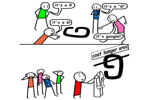
Our central vision works differently. When looking directly at individual objects, humans find patterns. Envision four pairs of dots in a straight line with a small space between each pair. You’re anatomically predisposed to register the gaps and so perceive a pattern: four pairs rather than eight individual dots in a straight line.
Patterns make it easier to sort out all the new sensory information we’re constantly bombarded with. Even if there are no obvious patterns, your eyes and brain work in conjunction to create them. Basic shapes like rectangles and spheres are identified in everything you look at in order to make sense of what you’re observing.
Later, we’ll explore how this method of recognizing patterns is directly linked to the way you think and process information.
100 Things Every Designer Needs to Know About People Key Idea #2: You need to break down information and have a thorough understanding of memory to make a good product.
Every second of every waking moment, your subconscious is dealing with roughly 40 billion pieces of information. However, only 40 percent of this information makes it to your conscious brain. What makes certain knowledge stick, then?
Your brain is only capable of processing information in bite-sized chunks. Therefore, if you’re ever conveying information – whether in a presentation or an ad – make sure you don’t provide too much at once.
So how much should you provide?
Studies have found that four is the magic number. Obviously, it’s not always a viable option to provide information in chunks of four, but it’s always a good idea to split up whatever you’re trying to communicate into groups that contain no more than four elements.
If you look at American phone numbers, they’re divided up like this: 642-374-3847. As area codes are a familiar format likely to be stored in a person’s long-term memory, it’s logical to break phone numbers up into groups of three and four digits in order to make them more memorable.
Another good method for making information more digestible is progressive disclosure. The idea is to make the consumption of information as simple and clutter-free a process as possible. So a website using progressive disclosure might feature a list of categories that allows people to click on each category for more information, then click on other subcategories for further details.
So memorability is important, but the mechanism of forgetfulness shouldn't be overlooked. Forgetting information is normal – if you remembered everything, you’d literally be too stuffed with knowledge to function.
Your brain routinely decides what to remember and what to forget. Human forgetfulness is especially helpful when it comes to product design. If you design with forgetfulness in mind, you’ll make sure to include the important information, weaving it into the design or making it easy for people to look up.
100 Things Every Designer Needs to Know About People Key Idea #3: Use stories and clear organizational systems to make ideas suitable for long-term memory.
The scope of your short-term memory is limited, so embedding information into your long-term memory is difficult.
In order to remember information, people have to use it. By repeating and connecting newfound knowledge to something that you’re already familiar with, it’s more likely that the information will stay in your mind and transition from your short-term to your long-term memory.
The act of repetition actually physically changes the brain. If information is repeated frequently enough, the neurons in the brain form a trace so that it’s easier to retrieve memories at a faster rate.
In order to process information, people also tend to create categories – and it’s a good idea to consider this when you’re designing. Categorizing content into manageable chunks is one way to deal with the modern overload of information, and so it behooves you to present information about your design in an organized fashion by using subtitles and headings.
However, information is best processed in story form. Telling a story is an effective way of capturing your audience’s attention because a story has a chronological narrative that implies causation. This can be used to your benefit. Since the human brain is constantly looking for patterns, it fills in gaps by making leaps of causation. The formula of “this caused that, then this happened, then that” – the basic pattern of any story – is easy for the mind to follow.
Over 2,000 years ago, the poet Aristotle came up with the three-act story structure. The beginning sets the scene by explaining the characters and situation; the middle provides obstacles for the characters and a means of resolution; and the end shows the climax and conclusion.
Use this basic structure to create stories that make your products and services memorable!
100 Things Every Designer Needs to Know About People Key Idea #4: When making your product, remember that people crave empathy and rigidly follow social rules.
Have you ever noticed that, more often than not, when you smile at a stranger, the stranger smiles back? Well, that’s because imitation and empathy come naturally to people.
When you see someone performing an action, the premotor cortex in the front section of your brain activates mirror neurons. As a result, you mirror that person’s behavior. When you see an individual smile, your premotor cortex is responsible for causing you to smile, too.
Mirror neurons are also involved in the process of empathizing, which is the emotional response of deeply understanding how another person feels. And this brings us back to the importance of storytelling. Stories are important because they create images in the mind that may trigger the release of mirror neurons, which, in turn, lead people to experience empathy.
Imitation and empathy are ways that people connect with others, and both also inspire individuals to act in accordance with social rules.
When people interact, they tend to adhere to certain rules and guidelines. Let’s say your friend Tom asks you how you are. He’d probably expect you to respond in accordance with certain social rules. If you were to veer away from protocol and reply by saying something bizarre – “My auntie likes green!” – your pal Tom will probably be bemused.
And, when it comes to online interactions, people generally expect these same rules to be in place.
If a site is unresponsive or takes far too long to load, people will be put off, just as they would if someone ignored them or responded nonsensically to something they’d said. Therefore, when designing a product, it’s essential to think about the interactions your audience will have with it. Make sure it follows the rules of social interaction!
100 Things Every Designer Needs to Know About People Key Idea #5: People’s minds wander, but you can encourage a flow state with your design.
Most people have had the exasperating experience of reading the same sentence over and over again without taking any information in.
A study undertaken at the University of California found that people think their minds tend to wander 10 percent of the time, when, in actuality, it’s more like 30 percent of the time. It can even be as high as 70 percent – say, if you’re driving on an empty highway.
That’s why, when you’re in the process of designing, it’s vital to remember that people’s minds wander and that they’ll only focus on something for a limited period of time.
So if you’re designing a website, it’d make no sense for the welcoming page to be dominated by dense blocks of text. People simply won’t read it. It’s wiser to break up the information with images, play with the text format or include other media such as video. This will give your audience the illusion of wandering while staying focused on your product.
The polar opposite of the wandering mind is the flow state. Have you ever felt so engrossed in an activity that even your awareness of time fell away? Well, then you’ve experienced a flow state.
When in this mode, you’re almost always working toward a specific, doable goal. Maybe you’re fixing your bike or finishing a marathon; whatever the case may be, you enter a flow state when you’re journeying toward a certain goal, uninterrupted by thoughts of other goals. It’s such an enjoyable experience that people often want to return to this state.
However, flow states only arise when a person is deeply focused on the task at hand. If there are any distractions, that flow will cease to exist.
So to create a flow state for people while they use your product, you have to minimize distractions; you’ll learn how to do this in the next book summary.
100 Things Every Designer Needs to Know About People Key Idea #6: People are motivated by the prospect of achieving a goal – and dopamine helps, too.
Most people get a little thrill when a notification pops up on Twitter or Instagram, or when an email arrives. And that thrill is caused by dopamine – a chemical that controls the brain’s pleasure system and, thus, your feelings of enjoyment.
If you want people to experience a flow state while using your design, you have to provide constant feedback. This is especially important when designing online, and one way to do this is to send messages that update people with information on their performance.
In essence, this is similar to how social media apps work. Think about it: the little red notifications you get give you a dose of dopamine, and the prospect of another dose spurs you to continue using the app. It’s this easy access to instant pleasure that makes social media so addictive.
Another major source of motivation for people is knowing that the end goal is close.
Imagine that you’re offered a frequent-buyer card at your favorite local coffee shop. Every time you buy a cup, you get a stamp, and when your card is filled you get a free coffee.
Now imagine you could choose between two cards: one that has 10 unstamped boxes and one that has 12 boxes, two of which have already been stamped?
Of course, in both cases, you have to buy 10 coffees – but the card with 12 boxes will encourage you to get your free cup faster. This is because of the goal-gradient effect: people accelerate their behavior the closer they get to reaching a goal. So with two stamps already marked on the card, you’ll feel as though you’re closer to achieving it.
As this scenario demonstrates, people feel motivated when the finish line is in sight – even if it’s all an illusion.
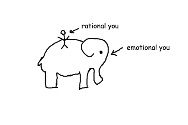
100 Things Every Designer Needs to Know About People Key Idea #7: People think that they have control over their choices, but most decisions are made unconsciously.
Imagine that, after a hearty dinner, you’re sitting in a restaurant looking at the list of desserts. After five minutes of reading, you realize you’ve barely made it halfway through! To some, this profusion of options might seem like heaven. But is it actually such a good thing?
Well, there are two ways of looking at it.
On one hand, having too many options can make it difficult to get what you really want. Often, when people are presented with such a pageant of possibilities, they get overwhelmed, and end up randomly choosing something that seems good enough.
On the other hand, people like having choices. For most people, more choice equals more control – and control is a good thing because human beings in better control of their environment have better chances of survival.
So, when designing, you have to take both of these perspectives into account.
The best way to do this is to provide people with the illusion of plentiful choice. That way, they’ll feel that they have to make a decision but the end outcome will remain the same. Say you’re buying a new iPhone from Apple – you get the option to pick between gold, rose gold or silver, but, at the end of the day, the color choice makes little difference. You’re still buying an Apple product.
In other words, if you were the owner of that imaginary restaurant, it might be wiser to offer one kind of dessert – ice cream, for instance – with many variations (vanilla, strawberry, pistachio and so on) than a wide variety of dissimilar desserts.
Designing is a complex, strenuous exercise with lots of factors to consider. However, if you keep in mind the tips from this book summary, you’ll have an easier time approaching the process in a manner that’s efficient, effective and, hopefully, fun.
In Review: 100 Things Every Designer Needs to Know About People Book Summary
The key message in this book:
When designing a product, it’s vital to consider how people’s minds work. From vision to the mechanics of memory and unconscious decision-making, the creation of a successful product requires that human psychology come first. Your design has to be tailored toward your specific target audience and communicate to them effectively.
Actionable advice
Incorporate unpredictability into your designs.
Unpredictability stimulates the production of dopamine, which makes people more likely to engage in the dopamine-inducing behavior again. That’s what makes an app like Twitter so exciting and addictive – you never know who’ll retweet or respond to you. Therefore, it’s essential to incorporate surprising elements like sound cues when your user is using your product to keep them coming back.