Has Don't Make Me Think, Revisited by Steve Krug been sitting on your reading list? Pick up the key ideas in the book with this quick summary.
When you head into an unfamiliar department store, what’s usually the first thing you do? To figure out where to go, many of us would look at a map of the floors.
Yet imagine if there was no map, and you had to wander aimlessly, wasting time and energy until you found the sporting goods section. Or perhaps you might find the store exit first, and choose to leave!
The online world is the same. Visit a well-designed website and you can find what you need in seconds; surf a cluttered, poorly organized site and you’ll leave before long.
This book summary explain exactly what you need to consider when building a website, sharing the hints and hacks that will make your website not only useable but also popular!
In this summary of Don't Make Me Think, Revisited by Steve Krug, you’ll discover
- why the world’s landfills are chock-full of unread user’s manuals;
- why doing what other web designers have done isn’t exactly a bad thing; and
- how pizza (and some cash) will help you build a great website.
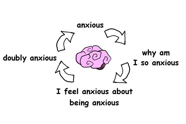
Don't Make Me Think, Revisited Key Idea #1: Instead of learning how a system works, we prefer to play and figure things out on our own.
Did you read the user manual to a technology gadget you purchased recently? Probably not.
Unless you happen to be an engineer, most people simply don’t care about how stuff works.
Imagine asking a random person on the street to explain how a browser or search engine operates. Although most people lack even the most basic knowledge about the mechanics of the internet, they can still navigate websites without much problem.
So when you buy a new device, often you just play around with it instead of reading the directions that explain how to use it. And then, when you find a method of operation that works for you, you stick to it.
You may have seen this behavior firsthand, for instance when someone searches for a complete website URL instead of using the browser’s URL bar to go directly to the desired website.
This is an example of a common decision-making strategy called satisficing. Given a problem, you’d think that a human would rationally search for information, identify solutions, compare them and then choose the best one. But in fact, satisficing is a more typical approach.
A study showed, for instance, that firefighters simply do a quick check for errors and then proceed with the first available solution. And these are people operating in high-pressure, high-risk situations!
In contrast, your average web surfer just needs to click the “back” button on a browser if she makes a mistake and clicks on an incorrect link. In general, we make decisions quickly as we surf online. Not only because it’s easier, but also because figuring things out independently feels like a game – it’s more fun!
In other words, our default internet behavior is to click on the first thing that catches our attention. And when this gets us what we want, we feel smart, comfortable and more confident.
Don't Make Me Think, Revisited Key Idea #2: Make it easy for users to scan your website for key messages and important information.
Imagine visiting a website with the following text on the home page: “Welcome to XYZ Corporation! We provide world-class clients with innovative products and customizable solutions...”
We’re all familiar with this sort of promotional corporate jargon and yet, we never read it.
Because usually, when we’re online, we’re on a mission – and we want to get this mission over and done with quickly. That’s why instead of plowing through long texts and reading carefully, we scan.
If you run a website and want to communicate a specific message, make sure you use the following elements: short paragraphs, headlines and highlighted keywords.
Additionally, organize these components using visual hierarchies, so users can decide which areas to focus on. This is important, because eye-tracking studies show that we make rapid decisions about where to look and completely ignore irrelevant areas, like advertising blocks.
Think about a print newspaper. On the front page, headlines, text and images are thoughtfully formatted, so that the reader can immediately glean what’s most important.
You should think of your website in the same fashion. Make it obvious what’s important, so that a reader can find that important information quickly and click on it.
This gets to another crucial point. Contrary to popular belief, most website visitors don’t mind clicking as long as the choice is mindless and the result is clear.
So make sure your website pathways are easy to navigate and understand. But don’t hide important information (like shipping costs) behind a lot of clicks, because that will only annoy your visitor.
Too often we imagine that building a website is like creating a product brochure for an interested buyer. But in reality, it’s more like building a billboard to attract cars rushing by at 60 miles per hour!
Don't Make Me Think, Revisited Key Idea #3: Since navigation is at the core of each website, it needs to be clear, simple and consistent.
Visiting a new website is somewhat like walking into an unfamiliar supermarket, with one major difference: online, you can’t walk around and look down every aisle. This presents a challenge.
Because if you don’t find what you’re looking for or don’t understand how a website is organized, your option to leave (and never come back) is just a click away.
Another challenge is that it’s difficult to judge the scale of a website, whether it has 100, 500 or 12,000 pages. And that’s exactly why it’s so crucial to design a site that a visitor knows how to navigate.
To do so, it helps to include a “sections” bar at the top of a page to communicate exactly what the site contains. Moreover, every page should include the following four additional navigation items to help a visitor move around.
First, don’t forget a search bar. With a search bar, a visitor can immediately find what she’s looking for, without having to learn the organizational concept of the site.
Second, consider a “You are here” indicator. Similar to a red dot on a map in a shopping mall, this small indicator lets your visitor easily navigate each page.
Third, link your company logo to your home page. This element should be present on every page, to give users a simple way to jump “home” if needed.
And fourth, include a utilities component. This space includes all the nitty-gritty information about how to use your site, like a log in space, a FAQ section, a site map and so on.
If these four elements are implemented correctly, a visitor is far more likely to feel comfortable and trust the people and company behind the website.
To make sure this happens, we’ll explore how to make these navigation items as self-evident as possible in the next book summary.
Don't Make Me Think, Revisited Key Idea #4: Conventions tap into what your visitor already knows to help them navigate your site effortlessly.
If you live in the United States but have driven a car in London (where they drive on the left), then you know exactly how confusing it can be when conventions are broken.
And that’s exactly why you should embrace conventions when you’re designing a website.
Users have certain expectations about where stuff is and how things work, which means they’re likely to get annoyed if something is presented differently.
Imagine how baffled you’d be if your favorite magazine decided not to print page numbers!
Page numbers are a print media convention, but we’re also used to conventions on the web. For example, when words are placed horizontally along the top of a page, we assume this list represents the main sections of the website.
Web designers often try to abandon conventions, seduced by the promise of doing something new and innovative. But conventions are established typically after years of fine-tuning and often represent the best and most effective practices developed to date.
Tab dividers are a good example. Tabs are a great navigation choice as people are already familiar with the concept of tabs, both from other websites and traditional filing systems. And so when we see them, we instantly know how to use them.
Of course, there is always room for innovation, especially as there won’t always be an appropriate convention to suit your needs. Just make sure that whatever you create is usable.
In other words: It’s not about suppressing your creativity. It’s about prioritizing the user experience.
Consistency and convention are your friends. It’s okay to stray a little as long as you maintain clarity and ease of use – with one important exception, which we’ll discuss in the following book summary.
Don't Make Me Think, Revisited Key Idea #5: Your home page should present a good first impression and clearly convey what your site is about.
When you follow a link from Twitter or Facebook, you often end up landing deep inside a website. But when you want to figure out where you’ve ended up and decide whether you should trust the site’s content, you often head to the site’s home page.
Since the home page plays such a crucial role, designing a perfect example is almost impossible. Everyone on your team will have an opinion!
Especially as items linked from the home page typically get more clicks, every stakeholder will vie for a spot. If you give in to everyone, your home page will be cluttered and too difficult to understand.
Don’t give in to the pressure! When designing a home page, your first priority should be to create an accurate first impression. This is critical! A study on web design showed that the first impression of a website sticks, even after a visitor spends more time on the site later on.
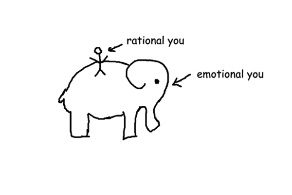
This is because our imagination goes into overdrive whenever we encounter something new. We create a big picture of how this new thing works, and then try to force the new information we gather to fit our preconceived notions.
So if a visitor is confused from the start, she’ll start misinterpreting your site. And that will only make her more confused the more time she spends on your site.
What can you do to avoid this? The most effective way to communicate with readers on your home page is to include a tagline, or a short sentence placed next to your logo that encapsulates the goal of your whole site.
A good tagline is lively and personable, and conveys the value of your site. For instance, news site The Daily Beast uses the tagline, “Read this, skip that.” The tagline for car-sharing service Zipcar is, “Wheels where you want them.”
At a glance, both taglines communicate clearly what the companies’ websites are all about.
Don't Make Me Think, Revisited Key Idea #6: Don’t rely on friends or coworkers to evaluate your website. Test, test and test again.
So your website should be easy to understand and navigate. But how do you ensure that your final product actually fulfills these goals? You might think to ask your friends, or simply trust your own judgment.
Unfortunately, you can’t rely solely on your own judgment. After all, you’ve built the website, so its awesome features and usability flows are obvious to you. It’s impossible to be objective!
Having discussions with friends about the site will be similarly fruitless. Because ultimately, people have wildly subjective opinions about what a website should be.
If you ask a designer, they’ll tell you they like beautiful pages with lots of white space and subtle touches that offer a pleasant visual experience. Meanwhile, a developer would prefer to see a site with lots of innovative features that a visitor can fiddle around with. And both the developer and designer will assume everyone shares their views.
We’re all like this! Whatever we like in a website, whether it be lots of colorful images or stark minimalism, is by default anathema to someone else. And few people try to see things from another point of view; we just assume that we’re “right.”
But in fact, there are no “right” or “wrong” answers in web design. And that’s why asking a couple of people for their opinions simply doesn’t work.
So instead, conduct tests. Watching people trying to navigate your website is the most objective way to evaluate what you’ve built and to figure out whether your website is working the way you intended.
Testing is also valuable because it removes the categories of “right” and “wrong” and shifts your attention to what is and isn’t working. What’s more, it shows you just how different web users are!
Don't Make Me Think, Revisited Key Idea #7: Watch people navigate your site to see where and how they fail to make sense of features.
Although testing is necessary, it doesn’t sound like a lot of fun to most people. That’s why you should be sure to offer compensation or special treats to test subjects (developers are particularly fond of pizza, for example) to ensure as many people as possible will test your site.
Your website should be understandable to anyone regardless of background, so don’t worry about selecting subjects only from your target audience. Any sort of person will do; just remember to reward your testers for their help – by paying them for their time.
Once you’ve selected a group, ask them to navigate your site while either you or a facilitator (someone patient and empathetic) watches and takes notes. One of the facilitator's goals should be to keep the user focused and comfortable.
Start with the home page. Have the tester click around and talk about what she’s seeing. That will give you a sense of whether she’s getting the main idea of the site. Ask questions such as, “What are you thinking?” and “What are you looking at?”
But make sure you’re not influencing the tester’s behavior. If she asks for help, say something like, “What would you do if I weren’t here?”
Get your test group to try out every feature on your site, including logging in, creating a profile or returning an item. If a tester fails at a task, watch her try to resolve it and then let her keep clicking until she either becomes too frustrated or you realize you can’t learn anything else from the session.
An important tip is to get managers, team members and other stakeholders to watch the testing process with you. Often people don’t see the point of testing, assuming the website is good enough.
But watching someone fail to use a website can be a transformative experience, making executives for example start taking usability seriously. In all probability, the next words out of a manager’s mouth will be, “Why didn’t we do this earlier?!”
Don't Make Me Think, Revisited Key Idea #8: Testing doesn’t have to be resource-intensive or time-consuming to produce useful insights.
Many web development teams avoid testing because they assume that testing involves a lot of time, money and expertise. But that’s not the case.
After all, you don’t need to test hundreds of people. You’re not conducting a scientific study, or trying to produce statistically significant results; you’re simply trying to inform your decision making and understand where people might struggle on your site.
To that end, you only need to test three normal, everyday web users and have everyone observing the testing process take notes on the top three problems that frustrate or confuse participants.
In the author’s experience, you’ll always encounter more problems than you can reasonably fix. Thus, you’ll have to prioritize and focus only on things that need fixing.
In other words, don’t worry about fixing problems a tester quickly recovered from on her own. These minor obstacles are part of the fun of exploring a new website.
Another benefit of keeping your testing group small is that you can start the process earlier, which makes testing that much more effective. The earlier you find problems, the easier it is to implement changes.
Just consider how much easier it is to adjust a beta site than one that’s already established, intricate and live! (Additionally, you won’t have to explain or justify changes to users familiar with a long-running website.)
You can also start testing before you’ve even built a website, by watching people navigate competitors’ sites. That way, you can generate useful knowledge that will inform your own development process.
Ultimately, by conducting testing early on, you can make better decisions throughout the development process. And this saves time, as you won’t have to redo everything at the end. All it takes is a few hours of time and a little bit of cash upfront.
Don't Make Me Think, Revisited Key Idea #9: Make sure your site’s mobile version loads quickly and prioritizes in-demand features.
Do you remember the pre-smartphone era? Even then, some cell phones had web browsers, but they were underused. It wasn’t until Apple introduced a touchscreen with swiping and pinching features that mobile browsing became so widespread.
Today, people move faster and read less online; what’s more, they’re more likely to leave a site as soon as they run into a hiccup. Don’t forget that mobile download speeds are unreliable and performance varies widely – so make sure your site loads quickly.
Your design also has to accommodate a smartphone’s small screen. Since you have less space to convey the same amount of information, you’ll have to make compromises.
Prioritize to ensure that in-demand features are quickly found. The rest of the information can be a few taps away, just as long as it’s obvious to a user how to get there.
Another important thing to note is that people use the internet everywhere and want to do everything on it. It’s a common misconception that people only use a smartphone on the go, and thus only need basic functions. The reality is that a user is just as likely to be sitting on the sofa at home while surfing on a smartphone, and will thus expect to access a site’s full menu of features.
That’s why you should always provide a link to the complete website and implement zoomability features. Returning visitors may be accustomed to your website, so they may not need to see an entire page to figure out how to navigate.
All in all, mobile computing is the future, and new possibilities for online interaction will provide amazing opportunities to create a great user experience.
Just remember that the only way to make sure you’ve built something usable is to test it!
In Review: Don't Make Me Think, Revisited Book Summary
The key message in this book:
Usability puts a visitor front and center, ensuring that it is as easy as possible to find information on a website. You can ensure that your website is delivering a great user experience by conducting simple tests at every stage of the development process.
Actionable advice:
If usability testing bores your boss, do it on your own time.
You don’t have to invite the whole executive suite to your first usability tests; the first steps can and should be simple and informal. What you need to do is to show exactly how testing can yield fruitful insights. You could, for example, measure the number of incoming support emails after you’ve corrected a mislabeled button; then send the data to your boss, along with a video of the test that initially drew your attention to the issue.
Suggested further reading: The Laws of Simplicity by John Maeda
The Laws of Simplicity consists of a set of “laws” formulated by the author to try to grasp the meaning and essence of simplicity. Along the way, it provides useful advice on how to introduce simplicity to our daily lives, business and product design.