Has You Should Test That! by Chris Goward been sitting on your reading list? Pick up the key ideas in the book with this quick summary.
Do you think of your website as a piece of art, where each page element, animation, link and headline combine to make a balanced, beautiful sculpture?
That’s a tantalizingly romantic image, but unfortunately it’s not the one that’s going to make your website help your business.
What you need is a website that functions as smoothly as possible – one that works more like a motorcycle than a sculpture: It’ll have to be constantly tested and tweaked, with new pieces added or taken away, and old pieces fixed or modified to make the whole machine run better.
This book summary show you how to make your website match your wider business goals by focusing on what is arguably the most important metric: conversion rate. You’ll also learn about which specific features of your website can improve your conversion rate, and how you can be sure your website is constantly improving.
In this summary of You Should Test That! by Chris Goward, you’ll learn
- why SEO is your conversion rate’s friend, not its enemy;
- how to make visitors stay on your website longer; and
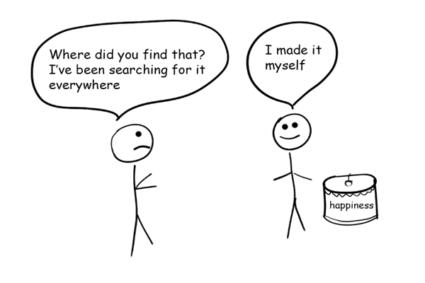
- how Wordpress learned to prevent its users from feeling anxious.
You Should Test That! Key Idea #1: Optimizing for a higher conversion unlocks hidden profits for your business.
In today’s Information Age, businesses need a good web presence if they want to succeed – even if they’re selling their products primarily offline. In fact, according to a study conducted by Experian, 90 percent of buyers research products online before purchasing them offline.
Clearly, you need a website. But not just any old website! To run a successful business, it’s not enough to optimize your website in a way that nets you huge traffic. That traffic needs to convert into immediate monetary value.
So your goal is to turn your site visitors into real customers, and that’s what conversion rate is all about.
The conversion rate describes what percentage of site visitors complete some action that you want them to carry out, such as making a purchase, signing up for a newsletter and so on. Simply put, your site’s conversion rate is its number of visitors divided by the number of those visitors who do the thing you want them to do.
Your goal, then, is to maximize the amount of products you sell to the visitors you already have using conversion rate optimization (CRO).
Not only does CRO directly affect your conversion rate, it also helps you to avoid the halo effect caused by a poorly made website. The halo effect is when a customer’s bad experience with your website negatively affects their perception of your products.
The author, for example, recalls a visit he paid to BlackBerry’s website, which was incredibly slow due to their use of large images. Once the page was finally fully loaded, the author was met with a range of the newest BlackBerry phones under the headline: “Unbelievably fast. Unmistakably BlackBerry.”
Irony aside, this slow loading time might make it harder for customers to actually believe that BlackBerry phones are as fast as they claim. Even though the website’s loading time is entirely unrelated to the phone, that general feeling of slowness continues to hang, halo-like, over the product.
You Should Test That! Key Idea #2: Many websites are optimized based on false assumptions.
When optimizing their website, most companies look to design agencies. The problem, however, is that a good design agency can’t necessarily optimize your site for conversion rate or revenue. While they may excel at creating a sleek, aesthetically pleasing website, they usually don’t know what your website’s business goals actually are.
In fact, many design agencies have no clue which criteria are most important for creating a successful website. This is apparent in the very first question design agencies ask their new clients: “What do you want your website to look like?”
Clients who don’t know any better tend to look at their competitors’ websites for inspiration. But what if those websites are as poorly optimized as your own? Without access to conversion data, it’s extremely difficult to gauge the actual effectiveness of their websites.
Consequently, companies are left to judge these websites based on how they look. But, really, the most important criterion is how the website works, how it affects revenue.
Another huge mistake designers make when redesigning a client’s website is using the HiPPO Method for decision-making, that is, deferring to the “highest-paid person’s opinion.”
When designers present their concepts to the client, the final decision is often left in the hands of one person, such as a department head or C-level executive. Yet, despite their fancy titles, such people are not always knowledgeable enough to make these kinds of decisions.
Instead, designers and companies should use the Customer Tested Method, based on the scientific method of hypothesis and testing.
With this method, you formulate hypotheses about which page design will produce the highest conversion rate, and then test it to see if certain designs and layouts yield more conversions.
If you have a promising layout, don’t argue about its effectiveness. Test it!
You Should Test That! Key Idea #3: CRO goes hand in hand with SEO.
When companies rebuild their websites, it seems like all they talk about is SEO. In their obsession with their search engine rank, some people worry that CRO will undermine all the hard work they put into climbing up to rank number one on Google.
Fixated on search engine rank, they tend to prioritize SEO over CRO. However, you need both to make a successful website, and they actually work hand in hand.
For instance, one CRO goal is to keep users on your site for as long as possible and to encourage them to take action while they’re there. Sites optimized for CRO are thus more user-friendly, which is also good for SEO.
To see how this works, consider that good sites have a clear content hierarchy, relevant pictures and relevant content, all of which keeps users engaged. Conveniently, these are some of the same criteria Google uses to determine a site’s ranking on their search engine.
So, by removing things like complicated animation that takes 90 seconds to load, visitors won’t get frustrated with the endless loading and so won’t leave your site after only a few seconds. This, in turn, will lead to a better conversion rate, and Google will recognize the faster load-time and improve your site’s rank.
Some people are also afraid that rigorous testing will result in deleted or altered site elements that were responsible for your good ranking. But this can easily be avoided with some simple tricks:
First, use a proper CRO tool with JavaScript Redirect that will make your test invisible to search engines.
Second, make sure that you use the same title tags, meta tags and heading content (all of which are important for SEO) from your old page on all pages you subject to CRO testing.
Now that you have a solid understanding of why CRO is so important, our following book summarys will reveal how to actually go about optimizing for conversion rate.
You Should Test That! Key Idea #4: Define your website’s goals before you start testing.
Your reason for building a website shouldn’t be “just because.” You have to have a clear reason for doing so, that is, you need clearly defined goals. Otherwise, you’re simply wasting valuable time and energy. These goals need to be much more substantial than “increase sales!”
Start by defining why your website exists at all. Did you build it to offer information about your company and products? Or do you want to generate leads for your sales teams? Is it for engagement on Facebook and Twitter? Or are you hoping to cultivate a special brand image?
Whatever your reason, it must be clearly defined before you can actually optimize for your desired results.
Next, make a list of website goals that follow from your top-down goals waterfall. Using this system, higher-order goals inform lower-order goals, which then inform your specific goals for conversion-optimization tests.
For example, your list might look like this: the first goal is to increase product sales, your second goal is to increase whitepaper downloads, your third to generate more blog comments and your fourth to raise social media activity.
Throughout this entire chain, the goal of optimization should be to increase product sales.
This system will make your site layout simpler, too. If you know that your primary goal is to increase sales, then every website element that boosts them should be improved first. Elements that work toward your second goal are secondary, and so on.
With your goals clearly defined, it’s time to figure out which website elements can actually increase the conversion rate for these goals.
You Should Test That! Key Idea #5: The LIFT model will help to identify the factors that influence conversion rate.
So how do you know which factors actually influence your conversion rate? One good way to find out is by using the LIFT model: Landing page Influence Function for Tests.
The LIFT model consists of six factors: value proposition, relevance, clarity, anxiety, distraction and urgency. Each of these factors can be improved in order to raise conversion rate.
Value proposition, that is, what your site offers its visitors, is the very foundation of conversion rate optimization. If they see that the benefits of your product outweigh its costs, then they’ll take action!
If you have a strong value proposition but struggle to communicate it, then you’ve got the perfect starting point for optimization. However, if your value proposition is weak, it will be difficult to improve conversion rates, even with a perfect website. If the product is no good, then you’ll have to go back to the drawing board.
With a strongly communicated value proposition, you can start optimizing the other factors:
Relevance, meaning that visitors who come to your site should find what they’re looking for easily. When people land on your site in search of something specific, they quickly scan the site looking for signal words, so you need to consider how to best display them.
For example, if they found your site while looking for fountain-pen ink, then it should be easy for them to find the section on the page where ink is sold.
Clarity is all about communicating what you mean. This is simple: just make your content easy to understand.
Anxiety refers to the hesitation that prospective customers have before taking action. A good way to combat this is by establishing credibility so that your visitors feel safe. Make it clear to them that you won’t send them spam or misuse their private information.
Reducing distraction means removing items from your site – such as animations or large images – that could steal attention from your primary message.
Finally, inspiring urgency makes the visitors feel that they have to take action right now. One way to create urgency is to make limited-time offers.
You Should Test That! Key Idea #6: Formulate a testable hypothesis for each factor.
Some businesses focus on only a single factor to improve their conversions. However, this is a grave mistake, as neglecting any one factor causes you to miss out on possible conversions. The more factors you improve, the better your conversion rate will be.
But to start improving the factors that affect conversion, you’ll need to develop hypotheses for them. Start by assessing each factor on your current page, and think about ways they could be improved.
The idea here is to transform your weaknesses into strengths. For example, imagine you assessed your wine website for relevance only to discover that your headline doesn’t even mention wine. This discovery gives you an opportunity to turn your weak headline into one that keeps customers on the page.
It’s now time to develop some hypotheses.
Each hypothesis is a statement following this formula: Changing [a problem or weakness] into [what you want it to be] will improve conversion rate for [your goal].
Going back to our wine example, you could hypothesize that repeating the word “wine” or other wine terms in the headline will increase the number of visitors who stay on your site, therefore improving conversions.
Furthermore, a good hypothesis is testable, meaning that it can be isolated in order to confirm or falsify it.
For example, “Our visitors prefer the Helvetica font” isn’t a testable hypothesis. In contrast, “Changing our headline font from Arial to Helvetica will increase the conversion rate for newsletter sign-ups” is testable, because you’ll definitely be able to say whether or not it’s true after testing.
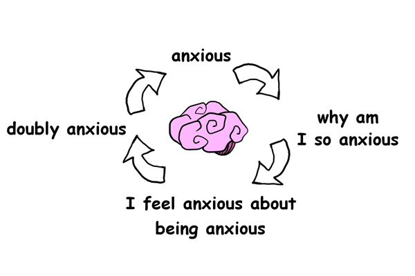
You Should Test That! Key Idea #7: Privacy and ease are the keys to reducing anxiety.
Have you ever visited a company’s website that just gave you the creeps because it felt unsafe and unreliable? That’s the anxiety that’ll kill conversion rates for even the best products. So, it’s crucial that you do everything in your power to make visitors to your site feel at ease.
We’re in the age of WikiLeaks, identity theft and controversial social-media privacy policies, so people are more concerned about their private data than ever before. Companies therefore have to try hard to prove their trustworthiness to customers and justify the collection of their information.
To drive the point home, consider that a 2009 Forrester Research online retail survey found that asking for too much information causes 12 percent of e-commerce shoppers to abandon their online shopping carts.
One thing you can do to reduce privacy anxiety is to decrease the number of form fields prospective customers have to fill out to complete a sale on your website.
Another way is to add text that explains why you need to collect data and how you’ll use it. You could either put it right in the form itself or in a special privacy policy section that you’ve added at the bottom of your pages.
Customers can also develop usability anxiety resulting from the frustration they feel when they have difficulty using your website. Poorly designed forms can confuse your visitors, and even make them feel stupid. And that’s all it takes to drive them from your site for good!
You should also assume that even the clearest forms will result in user error. One way to reduce usability anxiety is to point out mistakes made on forms in a gentle and friendly way.
For example, if you try to sign up at WordPress.com with a username that already exists, an italicized message will appear: “Sorry, that username already exists.” By apologizing and using unintimidating lowercase letters, people won’t feel stupid about their error and are encouraged to try again.
You Should Test That! Key Idea #8: Try to keep your visitors from getting distracted.
Users go through two stages when they land on a new website: the initial impression stage and the message-consumption stage. Distraction is a hazard during both stages, and when you allow their attention to wander away from your value-proposition message and your call to action, then you end up with a lower conversion rate.
Distraction in the initial impression stage can cause your visitors to leave right after they arrive.
The initial impression of a website occurs within seconds and is based completely on visual stimulus. During this stage, users make a quick decision about their next action: Do they stay on the page because it looks interesting or inviting? Or do they leave because it’s not visually appealing?
Knowing this, it’s important to test the different elements on your landing page, that is, the page visitors see first when they enter a website.
Try different layouts and headlines that draw the eye, and keep the number of images to a minimum. Be meticulous: even minor details like background textures and asymmetrical designs can cause distraction.
If your page has survived the initial impression, you’ll still want to reduce distraction in the message-consumption stage. Here, it’s important to concentrate on the quality of your messages and interactions.
Don’t overwhelm your visitors with messages that all compete for their attention. Instead, focus on a few messages on each of your pages.
This principle is widely known – even politicians get the best results when they stick to a few talking points and repeat their position. It’s no different for advertising messages.
It’s also worth reducing the number of choices a visitor has on each page. For example, if you’re selling laptops it’d be smart to present only a few basic options first, instead of presenting your entire catalogue at once.
You Should Test That! Key Idea #9: Test your hypotheses and analyze the results.
We’ve spent a lot of time talking about developing a hypothesis. But how exactly do you go about testing it?
Start by building a test plan, which includes your test goals and the structure of your experiment.
Your test goals will vary depending on your CRO goals. For instance, if your CRO goal is to generate more leads, then your test goals could be increasing online brochure downloads or newsletter sign-ups.
To measure your goals, you’ll need to establish goal triggers, specific user actions that demonstrate that the goal was completed.
If your goal is to increase brochure downloads, for example, then the goal trigger could be a “Thank you” page that appears after a successful download. By calculating how many people come to this page, you can calculate how many times your brochure was downloaded.
So how long should your test last? It’s not enough to gather data for just a few days. Rather, your test should run at least 10 days over two weekends to control for random variables. For example, it’s entirely possible that your higher conversions on Sunday aren’t related to your test goal, but simply to the fact that people have more time over the weekend to shop online.
Once you’ve performed your tests, it’s time to analyze the data and convert your findings into action. Be open to whatever conclusions you arrive at based on the data. You might find that changes you made to your site that you thought would be trivial end up having the biggest impact on conversions!
Finally, remember that CRO is an ongoing process. It will take more than one test to optimize your website. What’s more, your customers’ wants and needs will change with the times, so you need to be ready to change with them.
If you’re doing things right, then you’ll incorporate testing as a regular part of your operation in order to constantly drive and improve conversions.
In Review: You Should Test That! Book Summary
The key message in this book:
Great conversion rates depend on a lot more than just a great product. Rather, they’re the result of an ongoing process of rigorous testing, scrutinizing and experimentation.
Suggested further reading: A/B Testing by Dan Siroker and Pete Koomen
We all know that the internet has changed the way we do business. After all, today nearly every company has a website, but how many businesses manage to effectively optimize their online presence? Well, A/B Testing shows you how to develop and refine your website through simple experimentation and evaluation – all to attract more customers and boost your bottom line.
How did you like these "niche" book summarys?
In an effort to deliver valuable insights to all our customers, we're considering expanding our selection to also cover specialized and somewhat less accessible business topics such as conversion optimization. What do you think? Would you like to see more book summarys on such specialized topics? Just drop an email to remember@book summaryist.com and share your thoughts!